The Work and Play of Jeff Hayes
"It’s a stormy evening in Kinvarra when an out-of-town stranger walks into the middle of the Móirín’s pub and interrupts the community’s celebration of the Winter Solstice. Móirín decides that with enough Irish singing, dancing, story-telling, and perhaps a Mummers Play, they can make their new friend Irish by the time the sun rises on the shortest day. But the stranger has a story of her own to tell.”
I look forward to creating the Portland Revels show image each year, and this year was no different. It's a collaborative process with their Artistic and Managing Directors to try and arrive at the right mood, months before the production actually comes together. This year's story takes place in a small Irish fishing village, and we wanted a mysterious, dark vibe, while maintaining a sense of warmth and wonder at the heart of it.
Photos courtesy of Intersection & Natasha Kautsky
Mobile advertising for Oregon Ballet Theatre’s 2023-24 Season.
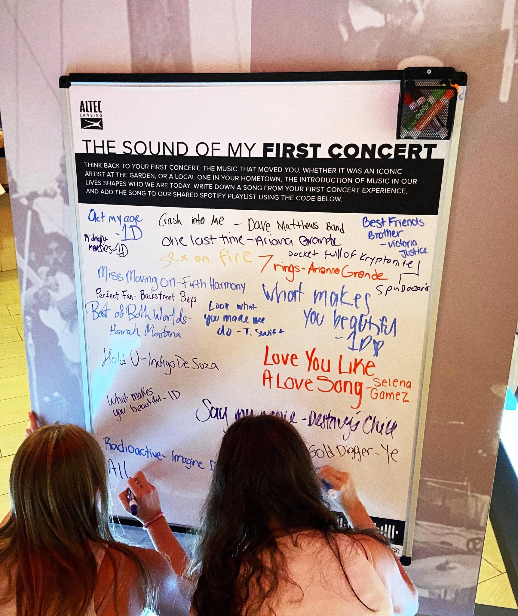
In addition to being responsible for preparing all print-ready assets for Altec Lansing’s display at Madison Square Garden, I was also tasked with designing the timeline seen here. Given brand guidelines, the bullet points and a variety of photos to choose from, I created a historical look at the company. The launch event, celebrating their partnership with MSG, also included a participatory panel, which I also designed.
These are the whiskey labels I’ve created for Brown Jug Alaska, released as part of their partnership with J. Mattingly, a bourbon producer out of Kentucky.
For Stormbreaker, they wanted to highlight the massive ravens up there in Alaska, and requested that it be shooting lightning into a bottle. Ask and you shall receive!
For Short Stack, they wanted something fun, and we went with a breakfast plate with the food in the shape of Alaska (the top of the pancakes even match the state flag).
Working with local marketing agency Project and the Salem Main Street Association, I created this map, the attraction icons, and the overall layout. They've been distributed to downtown businesses to help people know where to eat, drink and park, and I can imagine them being pretty useful for locals and visitors alike, who may not realize all there is to do there.
The mission of the Polaris Psychotherapists Consortium is to create an intentionally brave community of individual psychotherapists connecting and strengthening each other through a steadfast commitment to ethical therapeutic work and ongoing substantive learning.
Polaris Psychotherapists Consortium was founded for therapists by therapists with the goal of collectively working together in order to maintain accountable therapeutic spaces with a focus on education, growth, and new learning, social justice activism and advocacy, attunement to the complex and diverse needs of the people they work with, and ongoing in-depth consultation.
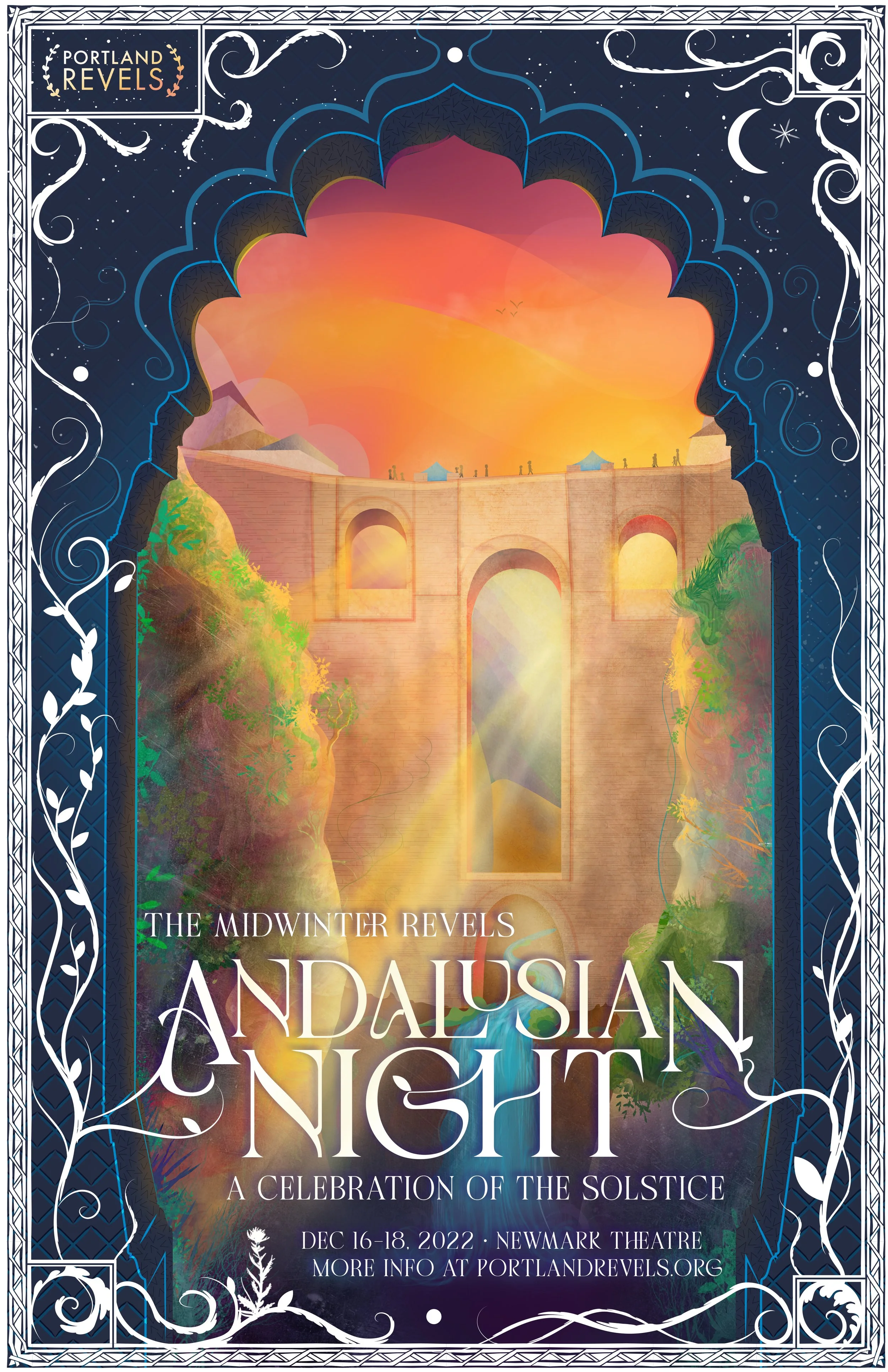
This is the show image for the 2022 Midwinter Revels winter production, Andalusian Night: A Celebration of the Solstice.
Doing research for this project led me to The Puente Nuevo bridge (featured) which was completed in 1793, spans a 390' chasm, and took 34 years to build. It was a replacement for a single-arch bridge, which was rushed in both design and execution, took 4 years to build and ultimately collapsed, taking 50 lives with it. Decidedly NOT the vibe we are going for here.
No, instead I took my time on this, both while building the composition in Illustrator, and while layering in all the lighting and details in Photoshop.
A commission for a private concert/campout weekend near Eagle Creek in the Columbia Gorge. I set the scene based on the actual location, and while I took some liberties with the flora and fungi, most of it is rooted in region-specific species, because details matter.
My time at Artists Rep placed me in a position to have significant impact. Through daily collaboration with fellow artists I produced thought-provoking, eye-catching work that embodied the feel and intent of our shows. Under the eye of the Marketing Director and Artistic Director, I created illustrations and social media campaigns for each production and transformed the overall brand of the theatre across social media, in physical spaces, through video work and in print.
Everything Else
A client’s aunt loves rhinos and commissioned this piece to be included as part of a care package. I was particularly happy with the sense of light, and how the sky turned out.
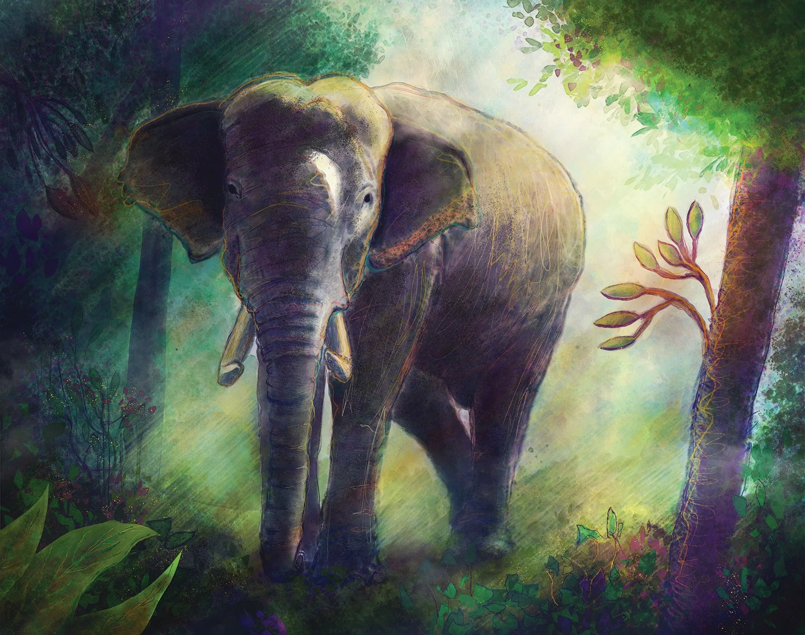
Another wildlife commission, for a client’s wife who loves elephants.
My first commission, for a friend's anniversary.
Now framed and hanging proudly in my mother's kitchen, this vibrant illustration was rendered using chalk pastels.
The first of my “Mushroom Kingdom Reimagined” paintings. World 1-1, where it all started.
The second in my “Mushroom Kingdom Reimagined” series. World 1-2, gone are the bright blue skies and green grass from above. We’re underground now, eerie subterranean light filters down, illuminating creeping roots and vines.
Going deeper in my “Mushroom Kingdom Reimagined” series, it’s time to dive in. Hope you can hold your breath!
The final in my “Mushroom Kingdom Reimagined” series. Beneath it all, the core of the Kingdom. Bowser’s domain yes, but also the home of the monolithic machinery that powers the whole operation.
It’s a pony, made of baloney, but it’s spelled bologna pogna. Fairly self-explanatory I think.
I’ve always loved the shapes and lines that make up classic cars, this one was based on a photo that Billy Strings shared of his work in progress.
An all-vector take on the previous project
Al Pacino (colored pencils)
The Man, The Myth, The Moustache. Painted in Photoshop.
Created 100% in Illustrator, this is proud knight is part of a larger project for a medieval themed carnival ride called the "Dragon Wagon".
Exercise in rebranding a company I used to walk past every day.
Inspired by a trip to the Oregon Coast, I painted this and then sold prints as a benefit for Friends of Yaquina Head Lighthouses.
Personal Illustration
The Space was a music venue in Salem, closed due to a legal battle over noise regulations. They held a benefit concert to help continue the fight. This poster started a series for me, focusing on vintage sci-fi visions of the future. Part 1 represents the middle of the voyage.
Part 2 of my space-travel series represents the launch, as our trust craft (seen from afar) breaks free of Earth's constraints.
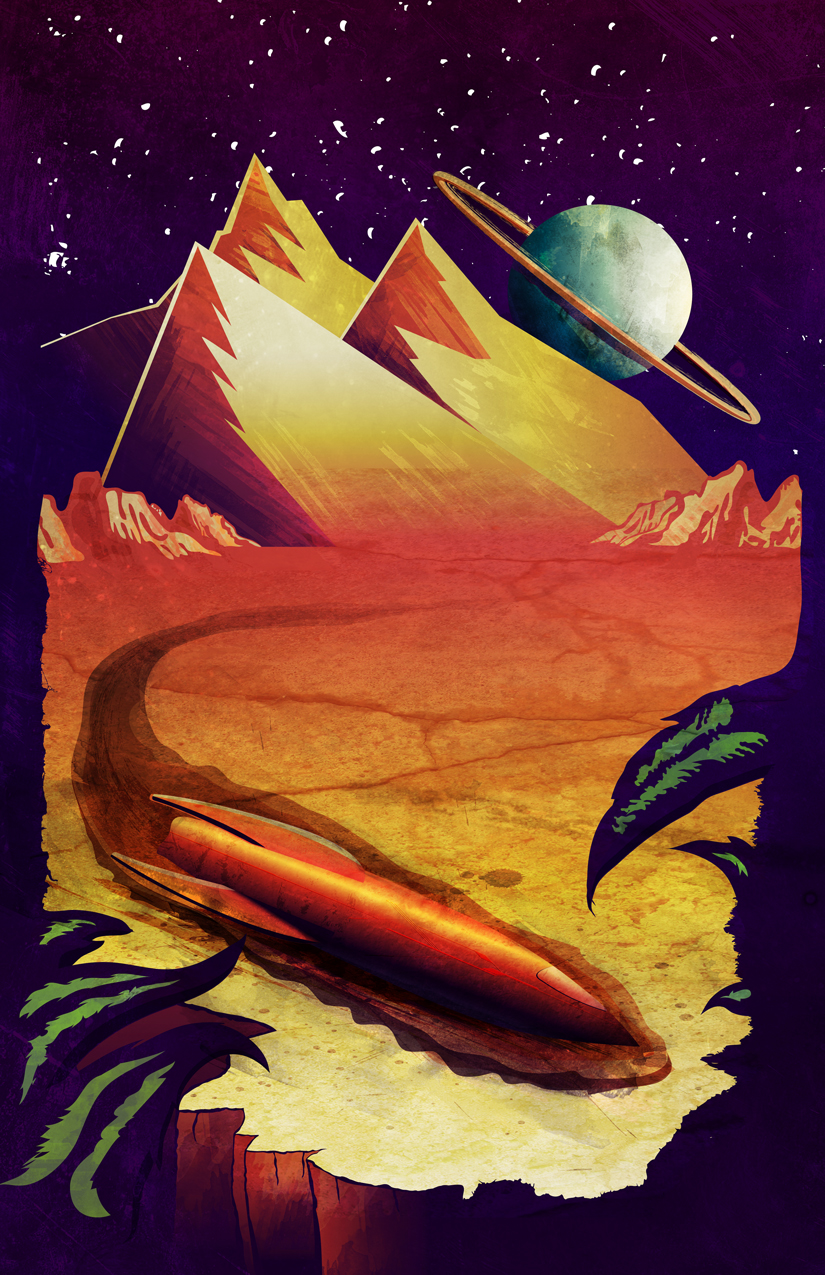
Part 3 represents the future of our trusty craft, crash landed on a distant planet, far from it's intended destination.
Part 1 of what was originally a photographic ad, rendered using colored pencils and copic markers.
Part 2 of what was originally a photographic ad, rendered using colored pencils and copic markers.
Arguably the most recognized attraction in Oregon, I wanted to put my own spin on this local icon. It served as a great opportunity to practice painting in Photoshop, and would later be printed onto canvas.
Another poster created using photographs I took combined with found textures.
PRC is a non-profit located in Corvallis. They focus on providing low-income and homeless families with food, shelter and employment opportunities. They wanted a bold image to draw people in, so I focused on propaganda art from the 1940's for my inspiration.
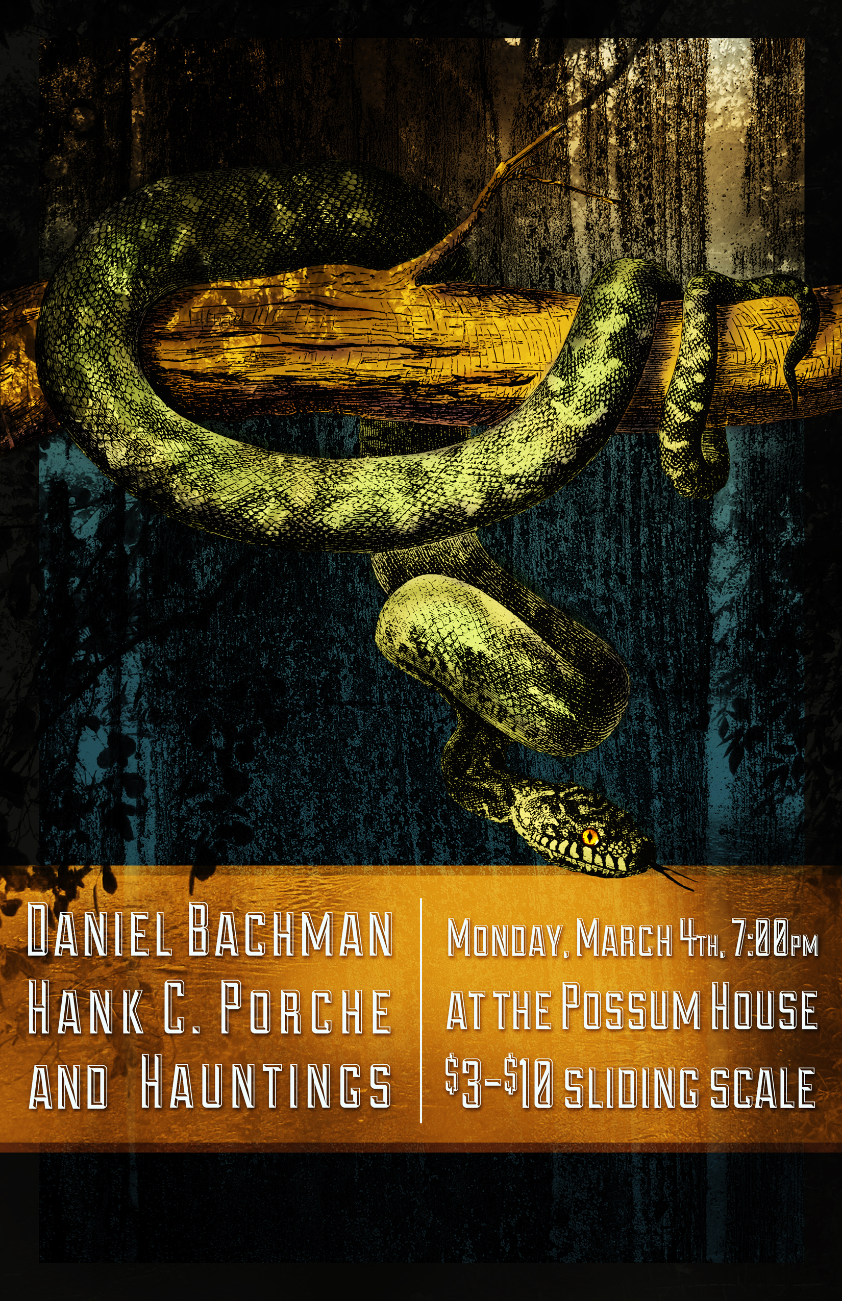
A poster for a concert at The Possum House.
A tribute to the greatest punctuation mark.
The idea for this started with the word popping into my head, seemingly out of nowhere. I felt the only way go get it out was to put it on paper. This might also mark the start of my blue/orange obsession.
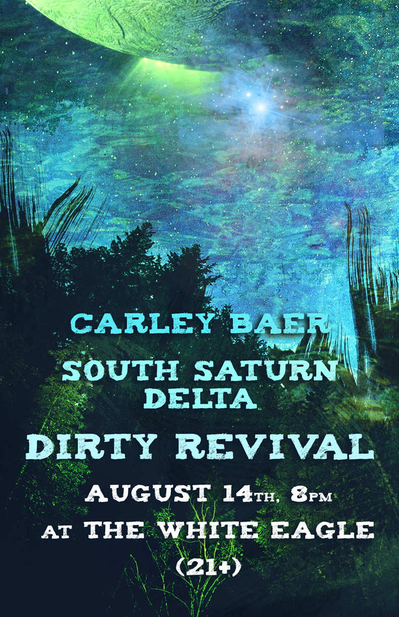
A concert poster built using personal photography and found textures
A concert poster built using personal photography and found textures
Developed as a constant reminder to myself.